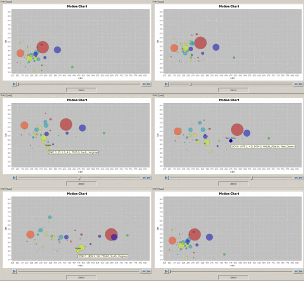
Motion chart

A motion chart is a dynamic bubble chart which allows efficient and interactive exploration and visualization of longitudinal multivariate Data.[1] Motion Charts provide mechanisms for mapping ordinal, nominal and quantitative variables onto time, 2D coordinate axes, size, colors, glyphs and appearance characteristics, which facilitate the interactive display of multidimensional and temporal data.
Overview
In general, charts, graphs and plots provide the means for summarizing quantitative and qualitative data using diverse graphical representations. The main limitations of such static types of data exploratory and visualization are the low number of variables that can be shown simultaneously on the chart. Many classical data visualization techniques have limitations in terms of the volume, properties or complexity of the dataset. For instance, Scatter plots require bivariate data. Many datasets include multiple measurements like time, space, demographic, phenotypic and functional recording. For instance, the annual US Housing Price Index dataset includes dozens of variable including location (State and US region), year, unemployment rate, state population, percent subprime loans, etc.
Motion charts provide a dynamic data visualization paradigm that facilitates the representation and understanding of large and multivariate data. Using the familiar 2D Bubble charts, motion Charts enable the display of large multivariate data with thousands of data points and allow for interactive visualization of the data using additional dimensions like time, the size of the blobs, and color) to show different characteristics of the data.
The central object of a motion chart is a blob (or bubble), which is a solid object homeomorphic to a disc. Blobs have 3 important characteristics – size, position and appearance. Using variable mapping, motion charts allow control over the appearance of the blobs at different time points. This mechanism enhances the dynamic appearance of the data in the motion chart and facilitates the visual inspection of associations, patterns and trends in multivariate datasets.
Examples of motion charts
There are several web-based motion charts graphical data visualization tools including Many-Eyes, Gapminder, Google Motion Charts, nanobi analytics, motion-chart by amCharts[2] and SOCR Motion Charts.[1] These graphical resources allow users to interactively explore relationships and trends of data with temporal characteristics.
See also
| Wikimedia Commons has media related to Chart. |
- Bar chart
- Bubble chart
- Diagram
- Edward Tufte
- Exploratory data analysis
- Information graphics
- Graphic organizer
- Mathematical diagram
- Official statistics
- Plot (graphics)
References
- 1 2 Al-Aziz, J, Christou, N, Dinov, ID. (2010). SOCR Motion Charts: An Efficient, Open-Source, Interactive and Dynamic Applet for Visualizing Longitudinal Multivariate Data, JSE, 18(3), 1-29.
- ↑ Grossenbacher A. (2008). The globalisation of statistical content Statistical Journal of the IAOS: Journal of the International Association for Official Statistics 25:133-144.