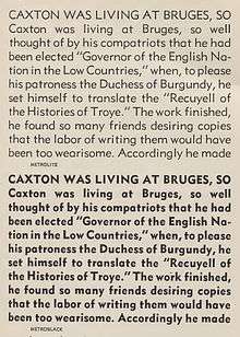
Metro (typeface)

Metro is a sans-serif typeface family created by William Addison Dwiggins for the American branch of the Mergenthaler Linotype Company.[2] It was released from around 1929 onwards for the hot metal typesetting printing equipment of the period.[3][4][5]
Metro was inspired by a wave of new "geometric" sans-serif designs such as Futura, which were based on simple geometric shapes like circles and straight lines, rather than on the traditional 'grotesque' style of sans-serifs such as Franklin Gothic.[6] Dwiggins however intended to create a font with breaks from pure geometry which could make the design more interesting to read in the lower-case, such as considerable variation in stroke width and sheared terminals on many letters.[4][7][8]
With a chunky design and wide spacing, Metro was often used in twentieth-century American newspapers for section headings, and Linotype promoted it with their 'legibility group' of typefaces such as Excelsior as suitable for printing on poor-quality newsprint paper.[1][4]
The Metro series was redesigned on entering production, with several characters changed to mimic the then-popular Futura.[9][10] Later additional weights were drawn by the Linotype team in-house. Some revivals return to Dwiggins' original design choices or offer them as alternates.[11]
Metal type releases
- Metro series
- Metrolite + Metroblack (1930)
- Metrothin + Metromedium (1931)
- Metrolite No.2 + Metroblack No.2 (1932)
- Metrolite No.2 Italic + Lining Metrothin + Lining Metromedium (1935)
- Metromedium No.2 Italic + Metroblack No.2 Italic (1937)
- Metrolight No.4 Italic + Metrothin No.4 Italic
Digitisations
Several digitisations have been released by Linotype, either based on the original or later designs or modernising the design concept and adding extra styles and weights.[12][13][14]
Besides official Linotype digitisations, many unofficial revivals or designs based on Metro have proliferated.[15][16][17] Concourse by Matthew Butterick is a loose revival adding a wide variety of stylistic alternate character designs and small capitals.[18] Bitstream's "Geometric 415" is an unofficial revival directly based on the original design.[19] Richmond by Jim Parkinson is a somewhat condensed revival created for the San Francisco Chronicle.[20]
References
- 1 2 The Legibility of Type. Brooklyn: Mergenthaler Linotype Company. 1935. Retrieved 29 April 2016.
- ↑ Shaw, Paul. "William Addison Dwiggins: Jack of All Trades, Master of More than One". Linotype. Retrieved 26 December 2015.
- ↑ Heller, Stephen. "The Improbable Resurrection of a Quirky, Once-Popular, Art Deco Font". The Atlantic. Retrieved 29 April 2016.
- 1 2 3 Tracy, Walter (January 2003). Letters of Credit: A View of Type Design. D.R. Godine. pp. 174–194. ISBN 978-1-56792-240-0.
- ↑ Allan Haley (15 September 1992). Typographic Milestones. John Wiley & Sons. pp. 85–90. ISBN 978-0-471-28894-7.
- ↑ Connare, Vincent. "The Type Designs of William Addison Dwiggins". Retrieved 29 April 2016.
- ↑ Shaw, Paul. "Typographic Sanity". Blue Pencil. Retrieved 1 July 2015.
- ↑ Devroye, Luc. "William Addison Dwiggins". Type Design Information Page. Retrieved 29 April 2016.
- ↑ "Metro No. 2". Fonts In Use. Retrieved 29 April 2016.
- ↑ "The Art of Ian Bow: "Portrait of a Painter"". Fonts In Use. Retrieved 29 April 2016.
- ↑ "Monotype Metro Nova" (PDF). Fonts.com. Monotype. Retrieved 2 September 2015.
- ↑ "Metro Nova". MyFonts. Linotype. Retrieved 29 April 2016.
- ↑ "Metro No. 2". MyFonts. Linotype. Retrieved 29 April 2016.
- ↑ "Metro Office". MyFonts. Linotype. Retrieved 29 April 2016.
- ↑ "DH Sans". MyFonts. FontHaus. Retrieved 29 April 2016.
- ↑ "Grosse Pointe Metro". MyFonts. GroupType. Retrieved 29 April 2016.
- ↑ "Examiner NF". MyFonts. Nick's Fonts. Retrieved 29 April 2016.
- ↑ Butterick, Matthew. "Concourse Font". Typography for Lawyers. Retrieved 3 November 2015.
- ↑ "Geometric 415". MyFonts. Bitstream. Retrieved 29 April 2016.
- ↑ "Richmond". MyFonts. Retrieved 2 October 2016.