Avenir (typeface)
 | |
| Category | Sans-serif |
|---|---|
| Classification | Cross of geometric and humanist sans-serif |
| Designer(s) | Adrian Frutiger |
| Foundry | Linotype GmbH |
| Date released | 1988 |
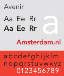
Avenir is a proportional geometric sans-serif typeface designed by Adrian Frutiger in 1988 and released by Linotype GmbH, now a subsidiary of Monotype Corporation.
The word avenir is French for "future". The font takes inspiration from the early geometric sans-serif typefaces Erbar (1922), designed by Jakob Erbar, and Futura (1927), designed by Paul Renner. Frutiger intended Avenir to be a more organic, humanist interpretation of these highly geometric types. While similarities can be seen with Futura, the two-story lowercase a is more like Erbar, and also recalls Frutiger’s earlier namesake typeface, Frutiger.[1]
Frutiger considers Avenir his finest work. 'The quality of the draughtsmanship – rather than the intellectual idea behind it – is my masterpiece. (...) It was the hardest typeface I have worked on in my life. Working on it, I always had human nature in mind. And what's crucial is that I developed the typeface alone, in peace and quiet – no drafting assistants, no-one was there. My personality is stamped upon it. I'm proud that I was able to create Avenir.'[2]
Releases
Avenir was originally released in 1988 with three weights, each with a roman and oblique version, and used Frutiger's two-digit weight and width convention for names: 45 (book), 46 (book oblique), 55 (text weight), 56 (text weight oblique), (75)85 (heavy), and (76)86 (heavy oblique). The typeface family was later expanded to six weights, each with a roman and an oblique version.
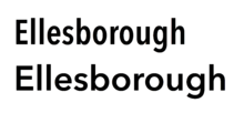
The original release of Avenir has weights grouped very close together, with the difference barely distinguishable. In his autobiography, Frutiger explains that this was a response to the effects of how people perceive colour. He intended the slightly bolder designs for white-on-black text, so they would look the same to a viewer as black-on-white.
Avenir Next

Between 2004–2007, Frutiger, together with Linotype's in-house type designer Akira Kobayashi, reworked the Avenir family to address on-screen display issues. The result was titled Avenir Next.
The initial release of the typeface family was increased to 24 fonts: six weights, each with a roman and italic version, in two widths (normal and condensed). Frutiger's numbering system was abandoned in favor of more conventional weight names. The glyph set was expanded to include small caps, text figures, subscript and superscripts, and ligatures.

Two extra font weights (light and thin) were added to the font for the release of Avenir Next W1G, for a total of 32 fonts. This release also added Greek and Cyrillic glyphs in the regular width only.
The current set of weights is therefore ultra light, thin, light, regular, medium, demi bold, bold and heavy, in four styles each (two widths and italics for each width). The installation on OS X does not include the thin and light weights, but does include Greek and Cyrillic glyphs in the regular width.
Janna
Janna is an Arabic variant designed by Nadine Chahine, based on the original Avenir. Janna (Arabic: جنّة), which means "heaven" in Arabic, was first designed in 2004 as a signage face for the American University of Beirut. The Arabic glyphs are based on the previously released Frutiger Arabic, but were made more angular.
Two roman fonts, in regular and bold weights, were produced. The typeface supports ISO Adobe 2, Latin Extended, Arabic, Persian, and Urdu characters, and tabular numerals for the supported languages.
Avenir Next Rounded (2012)
It is a version of Avenir Next with rounded terminals, designed by Akira Kobayashi and Sandra Winter.[3][4]
The family includes 8 fonts in 4 weights (regular, medium, demi, and bold) and 1 width (based on normal width), with complementary italics. OpenType features include numerator and denominator, fractions, standard ligatures, lining and old-style figures, localized forms, scientific inferiors, subscript and superscript, and small caps.
Usage
.jpg)
- The city of Amsterdam uses Avenir as the principal typeface in its corporate identity. The font was chosen when design bureau Eden Design & Communication won a citywide competition. Eden contracted Thonik for the new design.[5]
- In 2008, Wake Forest University adopted Avenir as its primary sans-serif typeface as part of a project to update the university's visual identity, noting that the font "conveys the balance, simplicity and strength of our University."[6]
- Avenir is used by the Eurovision Song Contest in all its brand communication materials.[7]
- A modified version of Avenir Next was created for Best Buy. This version, called "Avenir Next for Best Buy", is used in most Best Buy advertising and promotional material; the collection consists of 12 weights.[8]
- Since 2011, the Hofmann balancing group[9] (American Hofmann Corporation and Hofmann Mess- und Auswuchttechnik) have used Avenir for their logo and as their official font.
- Apple uses Avenir for its Maps app and some Siri screens in iOS 6.[10] OS X Mountain Lion and iWork for iCloud also come pre-loaded with various weights of Avenir and Avenir Next.
- François Hollande used Avenir on his campaign materials during the 2012 French presidential election.[11]
References
- ↑ Frutiger, Adrian (2014). Typefaces: The Complete Works. Walter de Gruyter. p. 230. ISBN 9783038212607.
- ↑ Adrian Frutiger, Typefaces. The Complete Works, (Basel: Birkhäuser Verlag, 2008), p337.
- ↑ A new form of an old friend: Avenir Next Rounded
- ↑ Neues Schriftdesign Avenir Next Rounded von Akira Kobayashi – gut lesbar, vielseitig und sympathisch – 6. Februar 2013 - Die neue Avenir Next Rounded ist die weichere Interpretation der serifenlosen Avenir Next
- ↑ Avenir, the future for Amsterdam. August 7, 2003
- ↑ "Section 4: Typography" (PDF). Identity Standards, Standards Guide. Wake Forest University. p. 3. Retrieved 2008-09-03.
- ↑ "Brand Guidelines" (PDF). EBU. p. 12. Archived from the original (PDF) on 2009-05-20. Retrieved 2010-03-09.
- ↑ "Archived copy". Archived from the original on 2013-08-31. Retrieved 2013-07-30.
- ↑ Hofmann balancing group]
- ↑ Betters, Élyse (June 26, 2012). "Apple adds Avenir typeface to iOS 6 in Maps". 9to5Mac.com. Retrieved June 27, 2012.
- ↑ François Hollande, le candidat du graphisme, retrieved November 13, 2012.
- Blackwell, Lewis. 20th Century Type. Yale University Press: 2004. ISBN 0-300-10073-6.
- Fiedl, Frederich, Nicholas Ott and Bernard Stein. Typography: An Encyclopedic Survey of Type Design and Techniques Through History. Black Dog & Leventhal: 1998. ISBN 1-57912-023-7.
- Macmillan, Neil. An A–Z of Type Designers. Yale University Press: 2006. ISBN 0-300-11151-7.
External links
- Type Gallery - Avenir
- Overview on Avenir Next features
- Avenir at typophile
- Avenir vs. Avenir Next
- Linotype presents Avenir Next, a classic font by Adrian Frutiger, thereby expanding the Platinum Collection with a further typography highlight.
- New Arabic Typefaces for Multilingual Communication Today
- Janna Font Family - by Nadine Chahine
- Avenir Next Brochure
- Avenir on Fonts.com
- Avenir Next Rounded