1869 Pictorial Issue
The 1869 Pictorial Issue is a series of definitive United States postage stamps released during the first weeks of the Grant administration. Ten stamps in denominations between one cent and ninety cents were initially offered in the series, with eight of these introduced on March 19 and 20, 1869 and the two highest values appearing somewhat later.[1] In May, however, the Post Office began distributing a revised version of the 15-cent stamp, in which the original, poorly aligned frame had been modified (a diamond shape was added above the vignette); and collectors consider this eleventh stamp an integral part of the Pictorial Issue. (The two 15-cent stamps were assigned separate Scott Catalogue numbers: 118 and 119.)[2][3]

The term "pictorial" denotes a revolutionary aspect of the 1869 series. Here the designers rethought the concept of what constituted an appropriate stamp subject, going beyond the established convention that U.S. postage stamps should present images only of dead statesmen. Such statesman-portraits appear, in fact, on only three values in the pictorial issue: the 1-cent Franklin, the 6-cent Washington and the 90-cent Lincoln. The other seven denominations contain a variety of images. Three stamps illustrate means of postal transportation: delivery on horseback (2 cent), by locomotive (3 cent) and by steamship (12 cent). Two others present historical tableaux drawn from famous paintings of crucial national events: John Vanderlyn's Landing of Columbus (15 cent) and John Trumbull's Signing of the Declaration of Independence (24 cent). The remaining values (10 cent and 30 cent) are variants on a patriotic eagle-and-shield design. An innovation no less striking in the 1869 pictorials was the introduction of the first two-color stamps in U.S. postal history, on the four denominations of 15 cents and higher. Each color had to be printed separately; and on a few sheets of the 15-cent, 24-cent and 30-cent stamps, the paper was placed in the press upside down for the second printing, resulting in America's first invert errors.[4] These error stamps command inordinate prices: at an auction in early 2011, used copies of the three inverts realized a total of a quarter of a million U.S. dollars, and the sum would have been as much as $100,000 higher had the 30-cent invert not had a small margin repair.[5]
During the past century, the pictorial series has enjoyed warm praise in philatelic commentaries: some have expressed admiration for the boldness of its concept and the skill of its miniaturistic engraving by James Smillie, others, affection for the period charm of its illustrations. The 12-cent value, with its image of the S. S. Adriatic, is often singled out as one of the most beautiful stamps ever produced.[6] Still others writers cite the nostalgic associations of the pictorials, noting that for most collectors of American stamps, the 3-cent locomotive—a common item of which many cheap copies are available—was the first issue of real antiquity to enter their collections, standing alone in the otherwise empty early pages of their albums. Most other values in the series, by contrast, are rare, especially the higher denominations, and for this reason as well the issue is held in veneration by many collectors.
The controversy over the series
Quite different, however, was the reception the pictorials faced in the months following their release in 1869. Early philatelic reviews were favorable, but soon a steady stream of severe criticism began to appear in the press, and the stamps rapidly sank into disrepute. As early as September, newspapers announced that the Post Office was planning a new definitive issue to supplant the unpopular series, and the replacements went on sale in April, 1870—less than thirteen months after the pictorials had first appeared. The new issue cost the taxpayer nothing, for the National Banknote Company's contract for U.S. stamp production required it to furnish—as the Postmaster stated in a written report—"new designs and plates ... at the pleasure of the Postmaster General, without additional cost to the department".[6] The remarkably brief tenure of the pictorials meant that relatively few stamps could be printed, which accounts for their scarcity today.
Many accounts characterize the strident criticism that greeted the pictorials as a spontaneous, broad-based public reaction, motivated by the patriotic conviction that national heroes were the only acceptable subjects for U.S. stamps. The truth, however, seems to be more complicated, for the tone of much of the press commentary about the pictorials suggests that an organized campaign was afoot to discredit them. To liken the design on the 30-cent stamp to "a bunch of rags hung out of a junk shop" as least raises an aesthetic issue; but the statement that the 2-cent stamp represented "Booth's Death ride into Maryland" is surely mudslinging pure and simple, indicating an agenda that has little to do with the question of stamp design.[7]
That the pictorials had been created by the widely reviled Johnson administration was scarcely likely to win them adherents. Grant's postmaster and his team were constrained to issue them without having had any say in their design or production, and thus had no reason either to like or to defend the new issue. Moreover, even before the pictorials appeared they had already acquired enemies as a result of the previous year's unusually contentious competition for the contract to produce the 1869 U.S. stamps. The designs and printing proposals offered by the National Banknote Company in June 1868 had been chosen by the Post Office, despite the fact that another firm—Butler, Carpenter—had submitted a lower bid. The deciding factor may have been that National held the rights to the patented apparatus used for incising stamps with grill-patterns, a procedure the Post Office had recently adopted in hopes of making it impossible to clean the cancellations from stamps and reuse them. Nevertheless, Butler, Carpenter strenuously protested the rejection of their low bid and mustered an array of allies in a protacted attempt to have the contract reassigned to them—even contriving to have an investigation launched by a Congressional committee, which delayed the actual signing of the contract with National until December.[6]
In this climate of ill will, a set such as the pictorials—an issue that avoided middle-of-the-road solutions—was particularly vulnerable, for features of the new stamps that were unfamiliar could easily be characterized as hopeless flaws by opponents who had been involved in the Butler, Carpenter fight. The pictures, in fact, were only one unusual factor. The stamps were smaller in dimension than previous ones and nearly square in format, in contrast to the oblong shape that had been customary. The reduced size enabled National to fit 150 stamp-images on a pane instead of the normal 100, and Butler, Carpenter had characterized this shrinkage as a penny-pinching short-cut that reeked of unfair competition. It is perhaps not a coincidence that public criticisms frequently deplored the small size and unfamiliar shape of the pictorials.
Not all objections, however, can be dismissed as illegitimate. It was surely impolitic to oust Washington from his accustomed place on the normal first-class-letter stamp and replace him with a Baldwin locomotive. The New York Evening Mail fulminated: "Our old three cent stamps were as perfect as they well could be…. They were National and American, as they ought to have been. The head of Washington was venerable…. But now think of the miserable, confused looking thing, with its wretched printing, that the Post Office has given us for the present three cent stamp. It is neither historical, national, [nor] beautiful…. What is there in a big chimney on a railroad carriage to indicate the nationality of our postal system[?]."[8] Some critics registered complaints about poor quality gum, which may have been justified. Deriding the small size of the stamps, "[t]he comic papers exhibited caricatures in which the people were looking for their stamps in their pocket books with powerful microscopes." [8] And the designs were particularly vulnerable to being rendered unattractive or even risible by the poor quality control exercised by the still infant stamp production industry. Only collectors of exceptional affluence are able to afford well-centered copies of the pictorials; less fortunate hobbyists must often settle for lopsided examples that must have been even more displeasing to those who bought them at post offices in 1869.
Design and production
By early 1868, the existing definitive series of U.S. stamps had been in use for more than six years and plates were no longer in pristine condition. Problematic as well was that these stamps had indelible associations with the Civil War, a calamity that Americans were trying to put behind them. The printer of these stamps, the National Banknote Company, was operating under a contract that expired in February 1869, which meant that the Post Office would soon have to solicit bids for a new four-year stamp-production contract. These circumstances made 1868 an ideal year for the Post Office to plan a new definitive stamp series: for bidders on the contract could be required to submit essays for new stamp designs along with their proposals. The Post Office advertisement for bids recommended a new imaginative approach, even stating "that there should be variety in the sizes as well as the designs of the stamps".[6] While a variety of sizes did not ultimately appear, this stipulation may have been the germ of the decision to adopt a new size and new shape for the pictorials.
In fact, the 1869 issue was the first that offered designers the opportunity to plan an omnibus U.S. definitive series as a coherent whole, with the subjects and visual styles of individual stamps chosen to harmonize with one another in the context of an overall plan. The 1851–61 series had grown piecemeal, beginning with only three stamps to which five more were haphazardly added, resulting in a lopsided pantheon (Washington graced no fewer than five of the stamps). The next issue in 1861 had to be prepared in a tearing hurry (the aim was to prevent the Confederacy from converting previous U.S. stamps into cash), and as a result, no thought was given to appropriate stamp subjects: on each denomination the same statesman was depicted as in the previous series. In contrast to these almost accidental accumulations, "the new series was intended in some sort to portray the history of the Post Office in the United States, beginning with Franklin, the Continental postmaster and the post rider of the early days, followed by the locomotive of a later day and the Ocean Steamer carrying the mails…, the most important scenes in the early history of the country, its triumphant arms, and Washington its first and Lincoln its last President."[8]
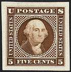
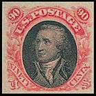
In keeping with the suggestions in the Post Office advertisement, the essays that National Banknote Company submitted for the new issue on July 22, 1869, indeed represented a fresh approach.[9] Six of the designs (1¢, 2¢, 3¢, 12¢, 15¢ and 24¢) were accepted with few alterations (most of the changes involved making the numerals larger—which, on some values, was not an aesthetic improvement). The remaining essays were quite different from the stamps ultimately issued. One interesting feature is that this July 22 version of the series placed Washington on two denominations—not a surprising duplication, given that so many Washington stamps had been included in the two previous definitive series. National submitted both five-cent and ninety-cent Washington essays. A five-cent stamp had been included in both preceding series, but this denomination was discarded late in the production of the pictorials in favor of a more useful six-cent value (easily created by revamping the five-cent Washington design). This was the first six-cent stamp ever issued by the U.S. Post Office. The ninety-cent essay, in a sense, looks both forward and backward in stamp history: it uses the same Washington image that had been employed in the 90-cent Washington stamp from 1861, and it places this portrait in the same frame that would later enclose Lincoln in the 1869 issue's final version.
 |
 |
 |
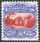 |
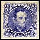
The July essays assigned Lincoln to the 10-cent value, while the 15- and 24-cent tableaux were accompanied by a third historical scene for the 30-cent denomination, drawn from John Trumbull's painting The Surrender of General Burgoyne at the Battle of Saratoga (this design was never produced in two colors, but has been conjecturally colorized here in the approximate shades of the 30-cent stamp that was issued). After Lincoln had been moved to the 90-cent stamp, a 10-cent version of the Signing of the Declaration was mooted, but around September, National provided the present Eagle-and-Shield design for the denomination. Late in production, the Post Office eliminated the Burgoyne stamp, fearing it would offend the British. The resulting hole in the series was filled by an ingenious adaptation of the Eagle and Shield: this tableau appears in red on 30-cent value, framed by flags, stars and halations of light printed in blue (while the flags are monocolored, the general red, white and blue impression of the stamp as a whole carries over to them). Many years later, in 1927, another engraving of Trumbull's painting would appear on a 2-cent sesquicenennial commemorative (prompting no British objection); and in 1994 the original Burgoyne 1869 tableau was finally issued on a stamp in a replica, printed entirely in blue but now somewhat enlarged in size and valued one dollar rather than the original 30-cents.[10] The Postal Service labeled this stamp "The Battle of Saratoga", downplaying the tableau's aspect as an image of English defeat.
Owing to the new size of the pictorials, the National Banknote company embossed them with a smaller grill pattern—the so-called G-Grill—than had been used on the previous series. The G-Grill is found only on this 1869 issue.
A second competitor
However much of a role Butler, Carpenter played in the press campaign against the 1869 Pictorials, another of National's rivals—the Continental Bank Note Company—saw the issue's failure as an opportunity to expand its own government business. Continental already supplied the nation with revenue stamps, and the firm now set out to wrest the postage stamp contract from National. In late 1869, Continental prepared preliminary essays for a new series of definitive stamps and submitted them to the Postmaster. These designs resembled the company's revenue stamps, engraved in a distinctive style marked by intricate fine-line filigree meant to combat counterfeiting.[9] Yet Continental's essays were also clearly planned to satisfy two criteria specific to the postage stamp controversy. First, in a rebuke to the Pictorials, each stamp featured a portrait of a statesman, as postal tradition had dictated. In addition, however, Continental attempted to provide the sort of national overview that the Pictorials' historical tableaux had suggested (neglecting this aspect might conceivably have invited unfavorable comparison). Thus on the Continental essays, each image of a president was accompanied by text that cited one of his significant contributions. The word "Independence" and the year "1776" accordingly appeared at the top of the 1¢ Washington stamp, while "Emancipation" and "Proclamation" surrounded the "3" on the Lincoln stamp. In the 6¢ "Monroe Doctrine" essay, a blank oval—unquestionably intended to be filled by a bust of Monroe—was provided within the numeral. Apparently, the Post Office returned these essays to Continental as rejected at the end of the year.[9] Indeed, no basis existed for ousting National, given that that firm—in punctilious compliance with its contract—had been submitting satisfactory essays for a new definitive issue since September.
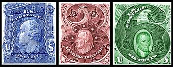
Aftermath
The failure of the 1869 issue had lasting consequences for U.S. postage stamp design. For the 1870 series, in response to complaints about the small dimensions of the pictorials, the Post Office adopted a larger size for postage stamps than ever before. Bidders on the 1873 production contract were not asked to submit stamp essays because the Post Office intended to retain the 1870 designs; accordingly, the winner—the Continental Banknote Company—took over National's 1870 printing plates, making small "secret mark" alterations to identify their product. All during the 1870s and 80s these designs remained; and while some were reengraved and a few new denominations were added, the Post Office did not dare to change the general appearance of U.S. stamps until 1890. Pictorial designs did not appear on stamps for ordinary mail until 1893: and those issues were carefully promoted as a special series in honor of that year's Columbian Exposition—one that would soon disappear, leaving national heroes as the sole subjects for definitives. It was not until the series of 1922–25 that the Post Office again placed pictures on definitive stamps—confining them, however, to values of 15 cents and above; the lower denominations still presented the normal portraits presidents and other famous Americans.
The 1869 pictorials had a brief moment of re-exposure when reprints of them appeared in 1875 (the Post Office that year reprinted many of its old issues, intending to display every U.S. postage stamp ever produced in its exhibit at the Philadelphia Centennial Exposition in 1876). In contrast to the rejection these designs met in 1869, centennial collectors welcomed the reprints and hastened to acquire them. The most obvious distinction between the originals and the 1875 versions is that the latter have no grills. Another difference is that yet a third type of the 15-cent stamp now appeared, similar in framing to the first 1869 version, but with some shading behind the vignette removed.[3]
Toward the end of the twentieth century, the U.S. Postal Service took a renewed interest in the pictorials. In 1989, at the World Stamp Expo (held in Washington, D.C. in conjunction with the 20th Congress of the Universal Postal Union), the Postal Service issued a souvenir sheet containing four images of the 90-cent Lincoln stamp from 1869: one in the original red and black colors, the other three in various trial color combinations.[11] Five years later, two new stamps appeared to commemorate the 125th anniversary of the pictorials. One offered the Battle of Saratoga design from the 1869 30-cent essay, reworked (as aforesaid) as a one-dollar stamp. The other was a five-dollar issue based on a distinctly odd experimental three-cent essay probably intended for the pictorials:[12] a design for a diamond-shaped stamp (corners top and bottom) presenting a dual portrait of Washington and Jackson.[13]
References
- ↑ Forster, Jeffrey (2012). "The Chronicle's Assistant Section Editor - 1869 Pictorial Issue". U.S. Philatelic Classics Society. Retrieved February 8, 2012.
- ↑ Scott Specialized Catalogue of United States Stamps (Scott Publishing Company, New York, N.Y., 1982)
- 1 2 "J. C. M. Cryier, Three Types".
- ↑ 1869 PICTORIAL INVERTS
- ↑ "Siegel Auction Galleries, Sale Number 1004, Tuesday, March 1, 2011, Pictorial inverts, lots 185, 186, 187". Retrieved February 13, 2012.
- 1 2 3 4 Lester G. Brookman, The United States Postage Stamps of the Nineteenth Century, Volume II, 1861–1882 (David G. Phillips Publishing Company, North Miami, 1989)
- ↑ "1869 Pictorial Issue". Siegel Encyclopedia.
- 1 2 3 John K. Tiffany, History of the Postage Stamps of the United States of America, 1887, C. H. Mekeel Philatelic Publisher, St. Louis, pp. 145-147.
- 1 2 3 Clarence W. Brazer, Essays for U.S. Postage Stamps (American Philatelic Society, 1941)
- ↑ "1-dollar Surrender of Burgoyne". National Postal Museum. Retrieved 2012-02-08.
- ↑ "1989 World Stamp Expo Souvenir Sheet". National Postal Museum. Retrieved 2012-02-08.
- ↑ Clarence W. Brazer, Third Addenda to Essays for U.S. Postage Stamps (The American Philatelist, 1943)
- ↑ "5-dollar Washington & Jackson". National Postal Museum. Retrieved 2012-02-08.
External links
| Wikimedia Commons has media related to Stamps of the United States. |
- 1869 Pictorial issue Smithsonian National Postal Museum
- Highlights of 1869 issue collection - Richard Frajola
- Identifier of the U.S. Pictorial Issues of 1869 - 1847USA
- USPS Official web site (history section)
- The 1869 Pictorials